Design: is your marketing team dyslexia aware?
Author: CIM COM
 Good design sets a brand apart. It helps to convey what’s being offered to the customer. And it connects tangible brand attributes with intangible emotional triggers. Yet in drawing up a new brand, launching a new website, creating a new campaign, does our profession meet the usability requirements of those who see things differently, like those with dyslexia?
Not only can accessible design streamline communications targeting this specific group, it can also improve general business-to-business and consumer communications. Why? Simply because around one in ten people have dyslexia. That’s a huge proportion of any brand’s potential target audience that could be switched off by bad design. Making brand communications accessible is a win win. It means less frustration for customers and creates more successful brands which are tuned in to the real people they serve.
- Take a look at the latest guidelines just launched by the British Dyslexia Association.
- Also get to grips with the dos and don’ts for clear communication with people with other issues such as low vision, hearing loss, autism and limited mobility. These at-a-glance posters were created by Karwei Pun and are available on the Government’s accessibility blog.
Are you dyslexia aware?
“Dyslexia is a common learning difficulty that affects roughly one in 10 people in the UK and can have a broad impact on people’s ability to process and remember information, affecting concentration spans and time management skills. But it is best associated with difficulty reading and writing,” states the British Dyslexia Association.
What’s it like to read text with dyslexia?
Victor Widell created a web page which attempts to show what reading is like for someone with dyslexia to a non-dyslexic person. You may find it tiring. See the page on Wikipedia.
A different perspective
Dyslexia is independent of intellectual ability. Whilst dyslexia is thought of as a reading problem this belies the fact that people with dyslexia have their brains wired differently, not better, not worse. People with dyslexia are often extremely adept at grasping the big picture, seeing patterns and trends. They can make connections that others may miss and provide creative solutions that are not obvious to the conventional brains around them.
Famous names with dyslexia
Albert Einstein, Richard Branson, Maggie Aderin-Pocock, Theo Paphitis, Kiera Knightly, Tom Cruise, John Lennon, Leonardo Da Vinci, Whoopi Goldberg, Jamie Oliver, Walt Disney, Holly Willoughby, Dominic Wood, Chris Robshaw, Steven Spielberg, Steve Redgrave, Michael Faraday, Agatha Christie, F Scott Fitzgerald, Erin Brockovich, Lewis Carroll.
Best practice for marketers
Seemingly purely aesthetic qualities of design take on a functional importance, because what use is your brand communication if its impenetrable, too hard to read or too much hard work to understand. The BDA Dyslexia Style Guide 2018 is a research-based tool for designers and indeed educators, which aims to improve ease of readability and understanding by setting out best practice.
Readable fonts
Choose sans serif typefaces such as Arial, Trebuchet and Calibri with a recommended point size of 12-15, with slightly more spacing between letters, words and lines. Avoid text in capital letters, italics and underlining which reduce readability.
Headings and structure
Break up blocks of text with headings to make the content easier to understand and follow. Headings need to stand out as headings by being around 20% bigger than the regular text. Bold text works well. Make use of the formatting tools so that people reading by using assistive technology can make sense of the structure when it comes to lists and new paragraphs, for example. Align text to the left and use white space to separate text from other design elements.
Colours
The background to your text should be a single colour, that contrasts with the text enough for the words to be clear. Dark text on a light background is recommended. A bright white background can be distracting so more muted creams could be considered. Avoid patterns and pictures as a background to text. Avoid reversed out text – white/light text on a black/dark background.
Written style
Use an active tone of voice rather than a passive one, for example, ‘find your nearest shop’ not ‘ways of finding your nearest shop’. Headings, bullet points and numbering help guide the reader through. Avoid long rambling sentences. Short sentences work better. Be direct. Be concise.
Clarity
Avoid elements which can be confusing or hard to understand, like abbreviations, unless explained where they first appear. Avoid double negatives since not being clear cannot be good! You end up with a maths equation wondering is there have been sufficient ‘nots’ to cancel each other out and make a positive. Why make the reader work that hard?
Images
Make full use of images to support your message. This includes:
- Flow charts to explain procedures.
- Graphics and icons to signpost different areas of content.
Of course, when it comes to online content, font sizes and screen colours can be adjusted within most popular operating systems.
Do and don’t posters
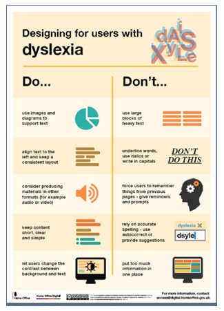
For a quick at-a-glance guide to accessible design take a look at Karwei Pun’s do and don’t poster for dyslexia created with Home Office Digital.

Accessible design tips
See the more accessibility posters from Karwei related to:
Deaf or hard of hearing affecting 1 in 6
Deafness and hearing loss faced by 1 in 6 people across the UK, that’s around 11 million people, according to the charity Action on Hearing Loss. Over 40% of people aged over 50 experience hearing loss. For those over 70, it’s 71% of people.
Low vision impacting 1 in 30
The RNIB which supports people with sight loss states that over two million people in the UK live with sight loss. That's around one person in thirty. Of these, around 360,000 people are registered with their local authority as blind or partially sighted.
Screen readers
A screen reader enables someone with sight loss, or who has difficulty reading to use a computer. This assistive technology such as Jaws or Voiceover can convert text into speech, relayed through earphones or speakers. Screen readers can also convert text into braille with the addition of a refreshable Braille display.
Autistic spectrum which affects 1 in 100
Around 700,000 people are on the autism spectrum in the UK. That's more than 1 in 100 adults and children. When you add their families for whom autism is just everyday life that’s 2.8 million people, according to The National Autistic Society.
Physical or motor difficulties
In the UK 11 million people have some form of disability. For 6.5 million people the issue is mobility, for 2.8 million manual dexterity and 2.7 million physical co-ordination according to the Government Office for Disability Issues.
See the Design Do and Don’t posters
Dyslexia Awareness Week 1-7 October 2018
The British Dyslexia Association will be promoting its guide in the run up to Dyslexia Awareness Week. Companies that provide accessible communications have an opportunity to show their support on their websites and social media. The organisation provides a range of online assets, such as these templates, banners and information packs from 2017.
Ads challenging stereotypes
Some brands choose to go further than accessible design, they reflect customer diversity in their advertising.
Disability: Famously Maltesers ads set to correct a few common misconceptions about disability. The ads created by Abbott Mead Vickers BBDO were targeted to provide a 4 per cent increase in sales, but resulted in double that, with 8 per cent sales growth. Despite some complaints the response to the ad has been overwhelmingly positive and it’s been viewed over 2 million times on YouTube. See: Maltesers - New Boyfriend.
Dyslexia: Who wants a dyslexic baby? See the video created by MadeByDyslexia.org to challenge attitudes to dyslexia: The Dyslexic Sperm Bank.
Deafness: To mark Deaf Awareness Week in May, ALDI aired a TV ad featuring child actress Maisie Sly. Maisie won an Oscar for her performance in the film Silent Child. What is remarkable about the ad is that it’s the first ever ad from ALDI which is silent and uses sign language, as well as Maisie’ infectious laugh. Take a look: Aldi Like Brands Fish Fingers Advert (Featuring Maisie Sly)
Mobility: ASOS included a disabled woman in its 2018 activewear ad, as just one of many people motivated to exercise. Expect to see more of this inclusion as brands become more aware of the benefits of reflecting their diverse customer base. Watch the ad: More reasons to move – activewear at ASOS launch video.